Banner Design
Problem Statement
To spread awareness about FHSA (First Home Savings Account) to people in Canada, I designed a banner to inform people about this savings account.

Before bringing the design to life, I researched what FHSA is and the benefits associated with this account. After understanding the FHSA and its benefits, I narrowed down the target audience.
Based on the research above, the specific target audience is set as individuals in their early to mid 30s who doesn't have background knowledge about FHSA. Also, people interested in buying a home and those who have done research are less likely to be unfamiliar with FHSA. Therefore, to widely spread information about FHSA, I targeted audiences who are not familiar with it, rather than those who already know about it.
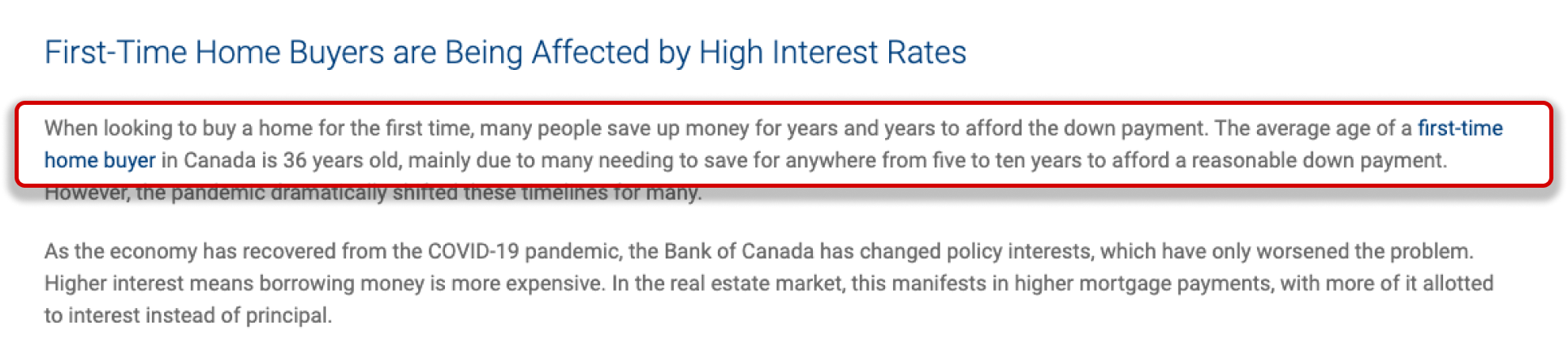
Source : RE/MAX
Competitive Research
With the goal mentioned in the previous step, I started with a rough idea and then looked at current bank banner designs for competitive research.
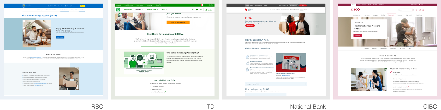
Looking at the competitor's banner design, instead of trying to fit all the information in a small space, they focus on the main keyword, FHSA. Details are provided more thoroughly after the user clicks the banner to be moved to the next page. Based on this, I kept my banner design simple. Instead of including a lot of information, I focused on visualizing the main keyword and information that would catch users' interest.
Design Considerations
Generally specific amounts of money tend to attract attention because they provide clear information and context. Since the target audience doesn't really have any background knowledge about FHSA, providing a specific number grabs their interest and leads them to click for more information in the next step. So, I decided to focus on designing around the benefit clearly stated with specific numbers; save up to $40,000.
Design Concepts

Concept A
People who don't know about FHSA, which is one of the target audience's characteristics, are more likely to be interested in text with specific amounts. So, I used the phrase "save up to $40,000" along with an illustration showing an affordable home that can fit in your hand.

Concept B
The target audience that i set earlier is mainly in their early to mid-30s, and previous research shows that this age group typically buys their first homes around this time. To relate to them, I included realistic images of people buying houses.

Concept C
Another characteristic of the target audience is they don't have background knowledge about FHSA, and people who don't know much about FHSA need simple, easy-to-understand visuals. So, I used illustrations showing tax deduction benefits to give them an idea right away. Then, I added short explanations in simple terms to help them understand better.